Why UX Is Now a Revenue Variable – Not a Design Decision
Most founders think about Website UX the way they think about branding — important, but downstream of the real work. Something you polish once the product is “done.”
That mental model is expensive. Forrester research shows that every $1 invested in UX design can return $100 (a 9,900% ROI) by boosting conversions, reducing churn, and accelerating workflows. User experience is now one of the most direct levers of revenue. It determines whether a visitor converts, whether a new user activates, and whether a paying customer stays or quietly churns.
The cost of getting it wrong is equally measurable. According to PwC’s Global Customer Experience survey, 32% of customers will stop doing business with a brand they love after just one bad experience. In a market where acquisition costs are rising and margins are compressed, that kind of single-interaction churn isn’t a customer service issue — it’s a UX issue.
When founders ask why UX matters for business, the real answer is simple: every interaction your product has with a user either builds momentum toward a decision or introduces friction that stops it. The shift happened gradually. Markets got crowded. Switching costs dropped. Customers developed zero tolerance for friction. A product that works but frustrates loses to a product that works and feels effortless — even when the underlying feature set is identical.
For founders thinking about UX for business growth, this shift changes how design should be evaluated — not as a visual layer, but as a performance lever that directly influences revenue.
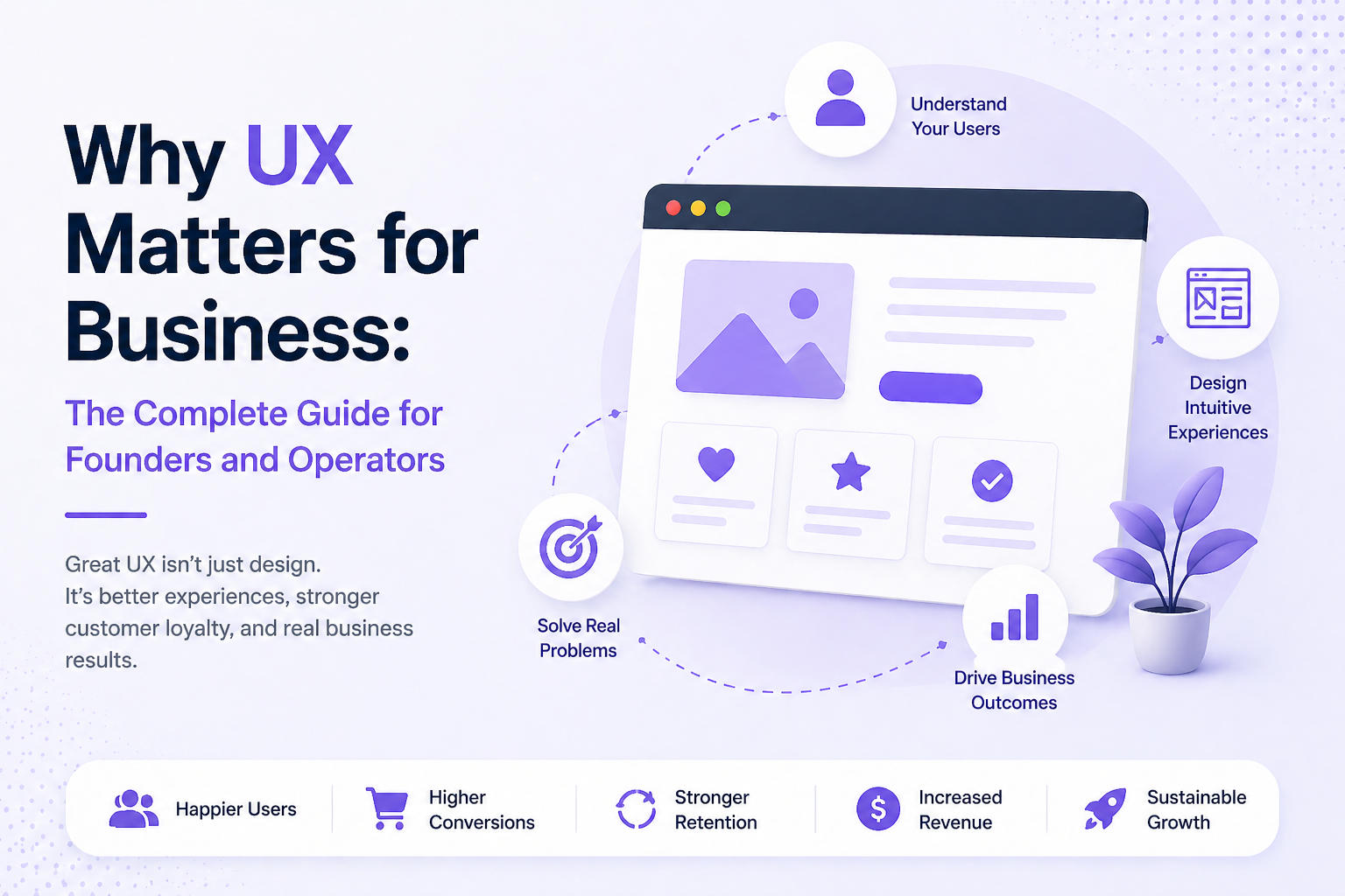
What Business-Grade UX Actually Means (Beyond Aesthetics)
The word “UX” gets flattened into visual design more often than it should. Clean typography, a good color palette, a modern UI — these matter, but they’re the surface layer.
Business-grade UX is about decision architecture. It’s the structure underneath the interface that determines what users do next, how long they take to do it, and whether they succeed without needing help.
The Three Layers That Actually Move Metrics
Functional clarity — Can users find what they came for without thinking hard? This is about information architecture, navigation, and the cognitive load your interface places on someone who has never used it before.
Interaction feedback — Does the product communicate what’s happening? Loading states, confirmation messages, error handling — when these are absent or vague, users lose confidence fast.
Emotional coherence — Does the experience feel like it was built for the person using it, or for the person who built it? This is about tone, terminology, defaults, and the assumptions baked into every flow.
These three layers compound. Fix all three and you have a product that earns trust. Neglect any one and you create a product that works technically but fails commercially.
How UX Drives Conversions, Acquisition Cost, and Lifetime Value
This is the section most UX conversations skip over — the actual financial mechanics.
UX and Conversions
How UX improves conversions is not mysterious: it removes friction between intent and action.
When a user arrives on your pricing page ready to buy, every unnecessary click, confusing label, or missing reassurance introduces hesitation. Hesitation becomes abandonment — and abandonment has a measurable revenue cost.
A well-designed checkout or signup flow doesn’t manipulate users; it simply removes unnecessary barriers. The relationship between user experience and conversion rate is often direct at the margin: when you make it easier to say yes, more users complete the action.
The business implication is straightforward. If small UX improvements increase completion rates across critical flows — sign-ups, demos, or checkouts — the cumulative impact on revenue becomes significant. This is the practical reason founders repeatedly ask does UX affect sales. In most digital products, the answer is measurable in funnel performance.
Research from the Baymard Institute puts a concrete number on the opportunity: the average large-scale checkout flow can increase completion rates by over 35% through targeted UX improvements alone — without changing pricing, traffic volume, or the underlying product. That’s not marginal. That’s a compounding growth lever that most businesses leave entirely untouched.
UX and Customer Acquisition Cost
Poor UX directly inflates your effective customer acquisition cost (CAC). When users abandon due to confusing flows or high friction, your conversion rates drop—forcing you to drive more traffic just to hit the same revenue target.
That means higher ad spend, more sales touchpoints, and greater content production costs. You’re paying to fill a leaky bucket. Improving UX seals those leaks, so every acquisition dollar delivers more paying customers.
UX and Lifetime Value
The impact of UX on business doesn’t stop at acquisition. A product that’s easy to use creates habitual users. Habitual users churn less. They upgrade more. They refer others. The LTV premium of a well-designed product over a poorly designed one — holding features constant — is real and measurable.
How UX Drives Growth Across the Customer Lifecycle
Think of your customer lifecycle in three stages: acquire, activate, retain. UX touches every one — but with different leverage at each stage.
Acquisition
Your website landing page, your onboarding copy, your pricing structure — these are UX artifacts. A confused visitor doesn’t convert. Clarity at the top of the funnel is often the highest-ROI UX investment you can make, especially for early-stage products where traffic is hard-won.
Activation
This is where most SaaS products lose the game. A user signs up, opens the product, and within the first three minutes decides whether this is worth their time. Activation UX is about making the “aha moment” — the point where value becomes tangible — as fast and inevitable as possible.
Poor onboarding is the single biggest driver of early churn. Not price. Not competition. Not product-market fit. Users often have intent and interest; bad activation UX kills that momentum before the product gets a fair chance.
Retention
Once a user is active, UX operates at a subtler level. It shows up in how quickly someone can accomplish recurring tasks. In whether the product teaches itself over time or requires users to relearn. Whether errors feel recoverable or catastrophic. These micro-experiences accumulate into a gut-level verdict: does this product respect my time?
Founder Insight: Map your lifecycle and ask where users drop off. The drop-off point almost always has a UX explanation. Fix that point before adding new features.
The Hidden Operational Costs of Poor UX
Most UX conversations stop at conversion rates and retention. But poor UX carries a second balance sheet — one that shows up in your operating costs, not your growth metrics.
Every point of friction in your product creates downstream inefficiency. Confusing onboarding flows generate support tickets that shouldn’t exist, pulling customer success resources away from high-value work. Unintuitive interfaces extend onboarding timelines, delaying the moment a new user — or a new employee — becomes productive.
Internal tools built without UX discipline compound this further: training cycles grow longer, adoption stays low, and workarounds quietly become standard operating procedure.
The sales motion suffers too. When a product is difficult to demo, difficult to explain, or difficult to trial without hand-holding, your sales team compensates with extra touchpoints — increasing cost per close and extending cycle length. That’s not a sales problem. That’s a UX tax on your go-to-market efficiency.
At scale, these costs are rarely attributed to design. They show up as inflated headcount in support, missed SLAs, slower ramp times, and margin compression that leadership struggles to source. For CFOs and operators, this is the reframe that matters: bad UX isn’t a design debt — it’s an operational liability with a recurring cost.
Warning Signs Your UX Is Quietly Bleeding Revenue
Most UX problems don’t announce themselves. They show up in the data — if you know what to look for.
- High traffic, low conversion — Users are arriving but not acting. The gap is almost always a clarity problem, not a value problem.
- Support tickets about navigation — When users regularly ask “where do I find X,” your information architecture is failing them. Every support ticket is a conversion risk you paid to resolve manually.
- Strong free-to-paid conversion, poor activation on paid plans — Users found enough value to pay, but the paid experience doesn’t deliver on the promise quickly enough. This is an onboarding gap.
- Churn clustering at a specific time post-signup — If users consistently churn at day 7, day 14, or day 30, something in the early experience is failing to embed the habit. Look at what users do — and don’t do — in those windows.
- High NPS scores but low referral rates — Users like you but don’t love you enough to tell others. This often means the experience is fine but not delightful. Delight is a UX outcome, not a marketing one.
The Most Costly UX Mistakes Businesses Make — and Why They Persist
Understanding does UX affect sales is one thing. Understanding why experienced teams still overlook UX issues is another.
Building for Internal Logic, Not User Mental Models
The most common mistake: organizing a product around how the company thinks about it rather than how users approach it. Navigation structures that mirror internal team divisions. Terminology pulled from technical documentation. Flows that make sense to the person who built them and nobody else.
This persists because the people building the product stopped being confused by it years ago. Proximity creates blindness.
Treating UX as a Phase, Not a System
Many teams run a “UX sprint” early in development, then ship. The assumption is that UX is a deliverable — something you complete and check off. In reality, UX degrades. As features accumulate, as edge cases get patched, as the product evolves, interfaces become inconsistent and flows become convoluted. Without ongoing attention, every new feature is a small UX regression.
Skipping User Research Under Time Pressure
Early-stage founders often skip research because they’re moving fast. This is rational in the short term and expensive over time. The alternative — building on assumptions — means you discover what users actually need through churn, not through intentional learning. Churn is a very expensive form of research.
Measuring the Wrong Things
Teams that measure page views and session duration miss the signals that matter: task completion rates, time-to-value, drop-off points in critical flows. Without the right metrics, UX problems are invisible until they become revenue problems.
High-ROI UX Improvements That Deliver Measurable Gains
Not all UX work is created equal. If you’re resource-constrained — and most founders are — prioritize changes with the highest measurable impact on acquisition, activation, or retention.
Simplify the Critical Path
Identify the single most important thing a new user needs to do in their first session. Remove every step that isn’t essential to that task. Every screen you eliminate from the critical path is a point of failure you’ve removed.
Write for the User, Not the Product
Button labels, error messages, empty states — these are UX decisions disguised as copywriting tasks. “Submit” is weaker than “Create your account.” “Error 403” is weaker than “You don’t have permission to view this — contact your admin.” Language that speaks to the user’s situation reduces confusion without a single line of code changes.
Design for Failure States
Most products design for the happy path. The users who convert and retain are often the ones who hit problems and found them recoverable. Good error handling, clear feedback on failed actions, and graceful degradation when things go wrong build more trust than a flawless flow that breaks silently.
Compress Time-to-Value
Ask: how long does it take a new user to experience the core value of your product? If the answer is more than a few minutes, you have an activation UX problem. Progressive disclosure — showing users what they need now rather than everything at once — is the most reliable tool for compressing that window.
Real-World Example: How Reducing Friction Increased Conversion Rates
The result was higher completion rates on forms — often dramatically higher — which their customers could measure directly in their businesses.
Typeform’s UX wasn’t decorative. It was their product’s core value proposition, and it drove UX for business growth at multiple levels: acquisition through word-of-mouth, conversion through measurable outcomes, and retention through sustained product value.
The lesson isn’t “be Typeform.” It’s that removing a single point of friction — one question at a time versus all at once — can be the entire competitive advantage. The business case was measurable, replicable, and defensible.
If you’re bringing in external UX help, the selection criteria matter more than most founders realize.
The wrong signal: portfolios full of beautiful screens with no context about outcomes. Aesthetics without metrics tells you nothing useful.
The right signal: designers or agencies who speak in conversion rates, task completion, drop-off points, and before/after comparisons. The question to ask directly — “How do you measure the success of your work?” — will separate the two camps instantly.
Look for partners who want to understand your business metrics before they touch the interface. Who ask about your user research before proposing solutions. Who treat UX as a hypothesis to be tested, not a vision to be executed.
Founder Insight: A UX partner who can’t explain how their work connects to your revenue isn’t a design partner — they’re a vendor. You need the former.
UX as a Growth and Retention Engine: The Long-Game Business Case
Most people underestimate how UX investment compounds because they never model it properly. Modeled right, the returns stack.
Year one brings higher conversions and lower early churn. Year two, retained customers expand, refer, and reduce support load, improving LTV and effective CAC. By year three, experience quality becomes a structural retention advantage competitors can’t easily replicate. It isn’t a feature. It accumulates.
Companies rarely win mature markets on features alone. Notion and Figma matter not because they were design-forward, but because their UX choices produced economic outcomes. When a product becomes how a team works, switching costs rise without formal lock-in. Leaving means re-learning, re-integrating, and absorbing productivity loss. That friction is structural, and UX created it.
Pricing power follows. Tools that reduce cognitive load face less resistance. Once embedded in workflow, the question shifts from “what does this cost?” to “what would it cost me to stop?” That’s pricing leverage created by experience quality.
Good UX is a moat because it compounds. It raises switching costs, deepens habits, lowers churn, and builds the pricing power others try to force through tactics.
The Business Case Is Already in Your Funnel
Most growth problems are UX problems in disguise. Before increasing ad spend or expanding headcount, look at where your existing funnel leaks. A two-point lift in free-to-paid conversion compounds materially over 18 months. Faster activation reduces early churn without a dollar of additional acquisition spend. Small, deliberate UX improvements — in flow clarity, onboarding sequencing, and error recovery — generate returns that scale with your business. The highest-leverage version of growth strategy often starts not with a new channel, but with a better experience.